Styling a Shopify Draggable React component with CSS
How to style our interactive gantt chart using CSS and custom SVG icons.

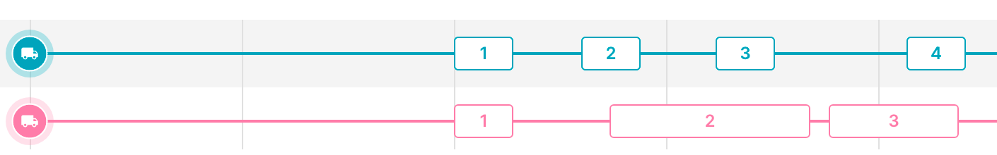
In the last post, we refactored a Shopify Draggable javascript widget into a modular component that can be used in any React web application. In this one, we'll style our component with CSS and add SVG icons to make it look just like the interactive gantt chart in Parcelizer (below).
Part 1: Using Shopify Draggable to build a drag and drop timeline
Part 2: How to use Shopify Draggable with React
Part 3: Styling a Shopify Draggable React component with CSS (this article)
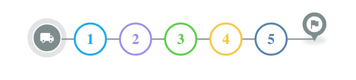
Here's what the Shopify Draggable react component we built in the last blog post will look like after we've styled it using CSS:
Just like in the previous tutorial, you can find working sample code for this project on Github.
Styling our component with CSS
CSS stands for Cascading Style Sheets. It works by selecting HTML elements on a web page and applying styles to them. As per best practice, we'll be using an external App.scss (a "sassy CSS" extension that introduces additional features to CSS) file so that there is a clear separation between the content (HTML) and presentation (CSS) of our web app.
To get started, let's compare what we built in the last blog post with what we'll end up with at the end of this one.

Taking the code we wrote in the last post, the first thing we'll do is to import the stylesheet file in the component file (App.js) and then add the required classNames to the JSX elements like so:
/* App.js */
import "./App.scss";

function App() {
  return (
    <div className="container">
      <div className="horizontal-menu sortable">
        <div className="wrapper">
          <div className="content drags">
            <div className="content drags">
              <SortableList
                draggableSelector=".dragItem"
                indexAttribute="data-index"
                onSort={handleSwap}
              >
                {({ initSortable }) => (
                  <div ref={initSortable}>
                    {blocks.map(({ bgColor, text }, i) => (
                      <div
                        className="dragItem"
                        data-index={i}
                        style={{
                          borderColor: bgColor,
                          color: bgColor,
                        }}
                        key={text}
                      >
                        <div className="text">{i + 1}</div>
                      </div>
                    ))}
                  </div>
                )}
              </SortableList>
            </div>
          </div>
        </div>
      </div>
    </div>
  );
}

export default App;
To change the rectangular blocks from the last post into circular ones. In App.scss, add:
/* App.scss */
.dragItem {
	display: inline-block;
	margin: 0 10px;
	background-color: #fff;
	border: 3px solid #888888;
	border-radius: 50%;
	width: 48px;
	height: 48px;
	cursor: pointer;
	font-weight: 900;
	font-size: 24px;

	.text {
		height: 100%;
		width: 100%;
		display: flex;
		align-items: center;
		justify-content: center;
	}
}
This does several things:
border-radius: 50%;rounds the block rectangle's corners andwidth: 48px; height: 48px;makes it a perfect circle.display: inline-block;lines up the draggable blocks horizontally andmargin: 0 10px;leaves a 10 px space to left and right of each block.
The next thing we'll add is the horizontal "timeline" line.
In App.js, add this line of code after <div className="wrapper">.
/* App.js */
<div className="line"></div>
And add the corresponding CSS to App.scss.
/* App.scss */
.line {
	background: #7f8c8d;
	width: 100%;
	height: 2px;
	align-items: center;
	position: absolute;
	left: 50%;
	top: 50%;
	transform: translate(-50%, -50%);
	z-index: -1;
}
The interesting bits are these lines of code, which we use to center the line across the draggable blocks.
left: 50%;This property positions the left edge of the line element at 50% of its containing element's width.top: 50%;This positions the top edge of the element at 50% of its containing element's height.transform: translate(-50%, -50%);This property moves the element by -50% of its own width and -50% of its own height. It effectively centers the element both horizontally and vertically. Not forgetting,z-index: -1;which shifts the line behind the draggable blocks.
Lastly, let's add the driver start and end icons. For this, we'll be using SVG icons. SVG (Scalable Vector Graphics) icons are widely used in modern web apps because unlike raster-based image formats like JPEG or PNG, SVG icons can be scaled to any size without losing clarity or sharpness. They are also fast to load due to their small file size.

We'll be adding our icons to the src/Markers/ folder as shown below (view in Github ).
src/
  Markers/
    icons/
        driver.js
        dropoff.js
        end.js
        pickup.js
        start.js
        stop.js
     markerIcons.js
Each icon (e.g. driver.js) is defined using XML markup, which consists of a series of tags and attributes that describe the shapes, colors, and other visual properties of the icon. For example, this is what start.js looks like.
/* start.js */
const Icon = (color) => {
  return `<svg width="64" height="64" viewBox="0 0 32 32" fill="none" xmlns="http://www.w3.org/2000/svg"> <circle opacity="0.24" cx="16" cy="16" r="16" fill="${color}"/> <circle cx="16" cy="16" r="11.5" fill="${color}" stroke="white"/> <path d="M20 14H18.5V12H11.5C10.95 12 10.5 12.45 10.5 13V18.5H11.5C11.5 19.33 12.17 20 13 20C13.83 20 14.5 19.33 14.5 18.5H17.5C17.5 19.33 18.17 20 19 20C19.83 20 20.5 19.33 20.5 18.5H21.5V16L20 14ZM13 19.25C12.585 19.25 12.25 18.915 12.25 18.5C12.25 18.085 12.585 17.75 13 17.75C13.415 17.75 13.75 18.085 13.75 18.5C13.75 18.915 13.415 19.25 13 19.25ZM19.75 14.75L20.73 16H18.5V14.75H19.75ZM19 19.25C18.585 19.25 18.25 18.915 18.25 18.5C18.25 18.085 18.585 17.75 19 17.75C19.415 17.75 19.75 18.085 19.75 18.5C19.75 18.915 19.415 19.25 19 19.25Z" fill="white"/> </svg>`;
};
export default Icon;
In the example above, the xmlns attribute specifies the XML namespace for SVG. The width and height attributes define the dimensions of the icon. The remaining tags spell out how the icon looks like - two overlapping circle (indicated by the <circle> tags) and a non standard shape defined by the <path> tag. start.js accepts a color string variable in its constructor which is used by the fill field to paint the icon. Here's what the final result looks like:
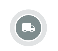
This particular icon was created by downloading the "local shipping" SVG file from the official Google Material Design collection (link to the truck icon), importing it into Figma and reexporting it as an SVG.
The markerIcons.js file generates an SVG image encoded as a data URI. Specifically, the imageMaker() function generates an SVG image and returns it as a data URI encoded in Base64, which can then be used as the image source for the icon with an <img src="..." /> tag.
/* markerIcons.js */
export const imageMaker = (color, type) => {
   return (
      "data:image/svg+xml;charset=utf-8;base64," +
      btoa(unescape(encodeURIComponent(icons[type](color))))
   );
};
To use these SVG icons in App.js, we simply need to import markerIcons.js
/* App.js */
import markerIcons from "./Markers/markerIcons";
and use it in an <img> tag like so:
/* App.js */
<div className="driver-start-location">
  <img src={markerIcons["start"]["7F8C8D"]} alt="truck" />
</div>;
This code draws the "start" icon and colors it #7F8C8D (light gray). Taken together, the CSS changes we made gives us an interactive gantt chart very similar to the one in Parcelizer. For the full source code, please see afilabs/shopify_draggable_styled on Github.
And that's a wrap! You now have an easy way to build an interactive gantt chart using the Shopify Draggable library.
👋 As always, if you have any questions or suggestions for me, please reach out or say hello on LinkedIn.