Needs

Data Visualizaton

Industry

Public Transportation

Client

Timeline

May 2020 - Mar 2021

ABOUT ASTAR

We’ve come a long way from using physical tickets, passes and stamps for our commute. Today, an urban city like Singapore has many systems and networks that generate digital data. For instance, residents use a rechargeable contactless smart card to tap in and out of public transport called the “EZ-link” card. There’s also bus and taxi GPS systems.

This wealth of data opens up new possibilities for exploring how transportation systems behave under normal conditions and stress. But the big challenge remains: bringing together stakeholders, such as policy makers, system operators and academic researchers, to solve transport problems.

A visualization platform can help everyone understand intuitively and deeply what happens when transport disruptions occur and learn which interventions work.

COMMUNICATING RESEARCH RESULTS

Clare Tan is a software engineer at a research institute in Singapore. She studied engineering at Imperial College, London. “Now I'm part of a research group that uses data-driven models and simulations incorporating buses, taxis and trains with the goal of building urban transportation systems that are robust and scalable,” she says.

The biggest challenge her group faces is communicating research results to stakeholders like transport operators, government officials, and members of the public, so as to effect meaningful change.

Visualizing complex data is the first challenge. “It’s one thing to read a scientific paper to find out that running your buses at an increased frequency reduces congestion by half. But it’s much better to press a button and see changes happen on the screen, or be able to compare two scenarios side by side!” Clare says.

While seeing is believing, the other challenge is involving all stakeholders via storytelling.

Policy makers responsible for taxis, buses and trains work in different departments and have different priorities. However commuters could take any combination of transport options to get to their final destination.

“We wanted to build a visualization tool that can bring them all to the same table to see how each transportation mode interacts with one another to tell a story,” Clare says.

BUILDING THE VISUALIZATION PLATFORM

To get everyone onboard and understanding the same story, her group aimed to build a visualization platform to combine and manipulate diverse data streams generated by their simulations.

The tool is called SUMMIT: Singapore Urban Multi-Modal Integrated Transport Simulation.

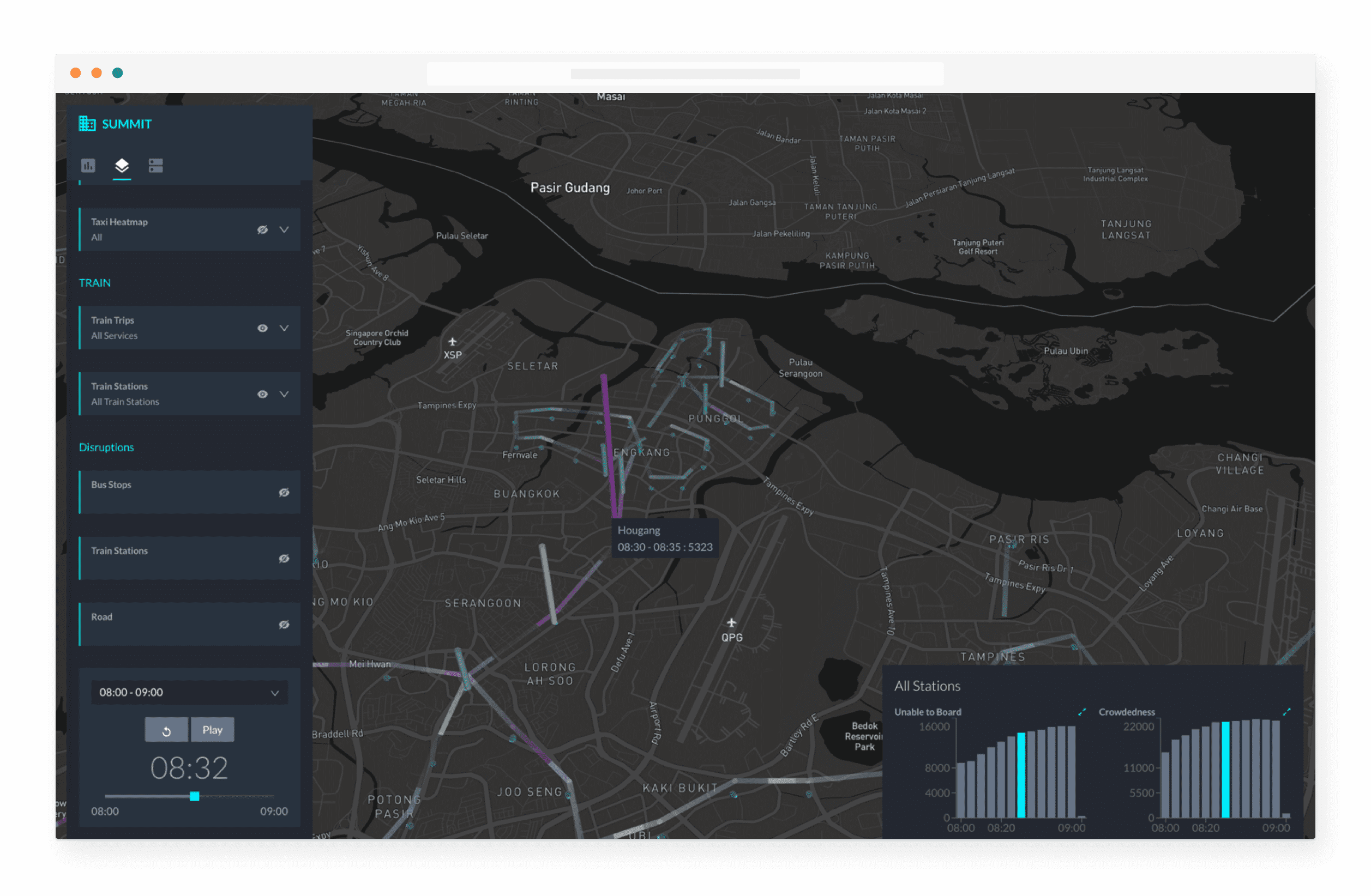
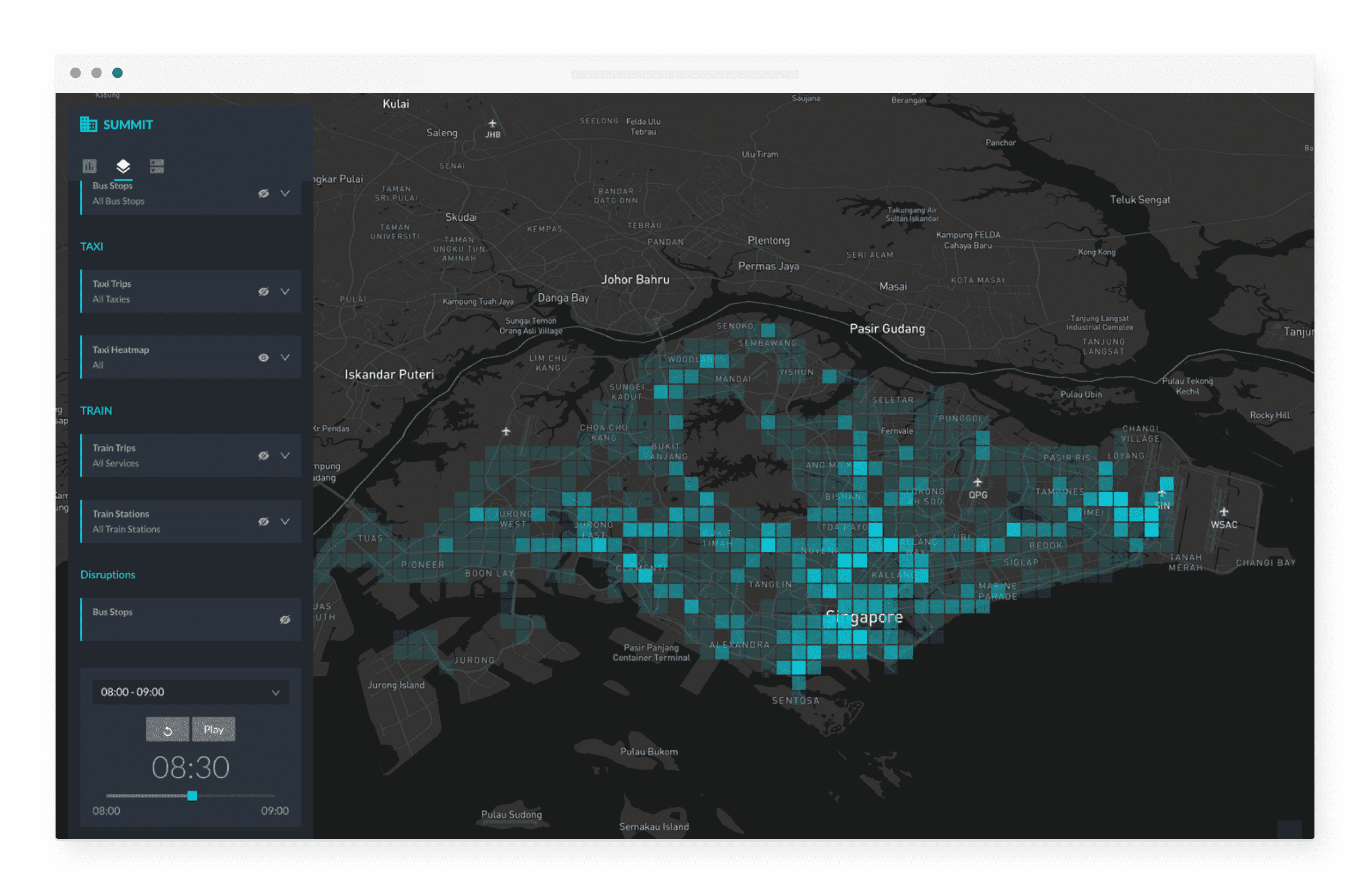
SUMMIT allows users to create visualizations combining multiple data sets (taxis, buses and trains) with different visualization modes like heatmaps, 3D and 2D bar charts, moving particles etc. This gives users their very own perspectives and insights into how Singapore’s transportation system performs.

SUMMIT is a web-based dashboard. Users can choose which transport modes they want to see on the screen by toggling them on the left hand panel. Once a transportation mode is selected, the user can choose specific services or transport lines to view.

There are different intuitive ways to view the data as well. For instance, a user might see individual train trips as moving particles, while train station passenger loads are viewed as 3D bar charts projected on a map of Singapore.

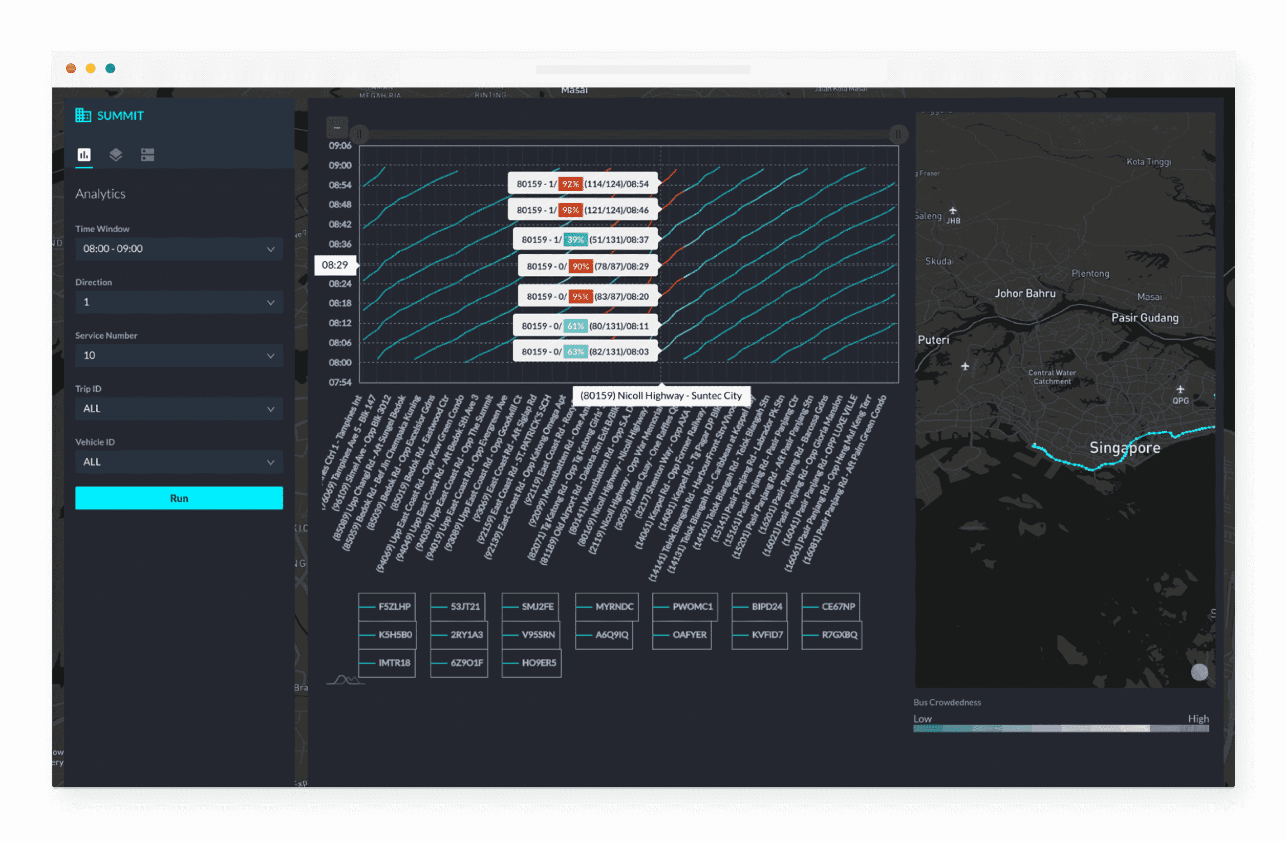
Moreover, users can also drill down into granular details, such as what is happening at each bus stop or train station by clicking on the mini 2D bar charts in the bottom right corner.

These bar charts expand to show in detail how passenger crowds vary at each bus stop over time, or how passenger load varies along a bus route. This lets users drill down and see how long-term demographic changes e.g. growth of young families in new towns affect the crowdedness of individual bus stops.

The most used feature by far is the playback interface. It runs through each minute of the simulation in detail. This allows all stakeholders to visualize cause and effects as well as see how exactly passengers are affected by disruptions, from trip delays to overcrowding.

“You can literally see passenger loads build up in response to a track fault or serious accident!” Clare says.

WORKING WITH AFI LABS

The project took about 8 months from start to finish with Afi Labs.

“We knew about Afi Labs because of their reputation for building cutting edge visualization platforms for public transportation. They have successfully completed several projects for Singapore’s Land Transport Authority (LTA) and IBM and we were impressed by their enthusiasm and vision for our project,” Clare says.

Before starting, Afi Labs explained how they would use IHPC’s algorithms and modeling results to create stunning visualizations in the simulation.

The tool was designed not just for experts, but also for laymen to interact and explore the various data sets.

Feedback was sent to Afi Labs once a week. Then, Afi Labs used that to determine missing data or other visualization methods needed for improved storytelling

“What we really liked is how Afi Labs would work tirelessly on mockup screens to show us before any code was written, essentially making the app before the app,” says Clare.

SUMMIT’S IMPACT: SHOWING, NOT JUST TELLING

The biggest impact that Clare saw after the launch of the tool is in communication.

“Our research is largely government funded, and there is an expectation that our research will be used to benefit society. For this to happen we need to close the feedback loop and communicate research results to the public officials responsible for managing Singapore’s public transport,” Clare explains.

Now, SUMMIT is a big part of that. For Clare, instead of referring to difficult-to-digest peer-reviewed papers explaining the effect of the policy, SUMMIT simply helps visualize cause-and-effects in the simulated environment.

Clare’s group can go beyond just one single scenario. “We can even load the simulation with different scenarios, such as increasing population density to show stakeholders what Singapore’s transportation system will look like 10 to 15 years from now.”

Future plans for SUMMIT are promising.

For one, Clare’s group plans to make SUMMIT as widely accessible as possible and also used as part of a policy toolbox that planners and analysts can use. There are also plans to extend the SUMMIT platform from the web to Tableau dashboards that users can load on their tablets to refer to on-the-go.

GET STARTED

Drop us a line and one of our experts will be in touch within 24 hours.

Vancouver

ADDRESS

595 Burrard Street
Vancouver,
BC V7X1L4
Canada

MAIL

[email protected]

PHONE

+1 415-802-2286

Singapore

ADDRESS

12 Marina Boulevard
Marina Bay Financial Center Tower 3,
Level 17-01
Singapore 018982

MAIL

[email protected]

PHONE

+65 6241-3013